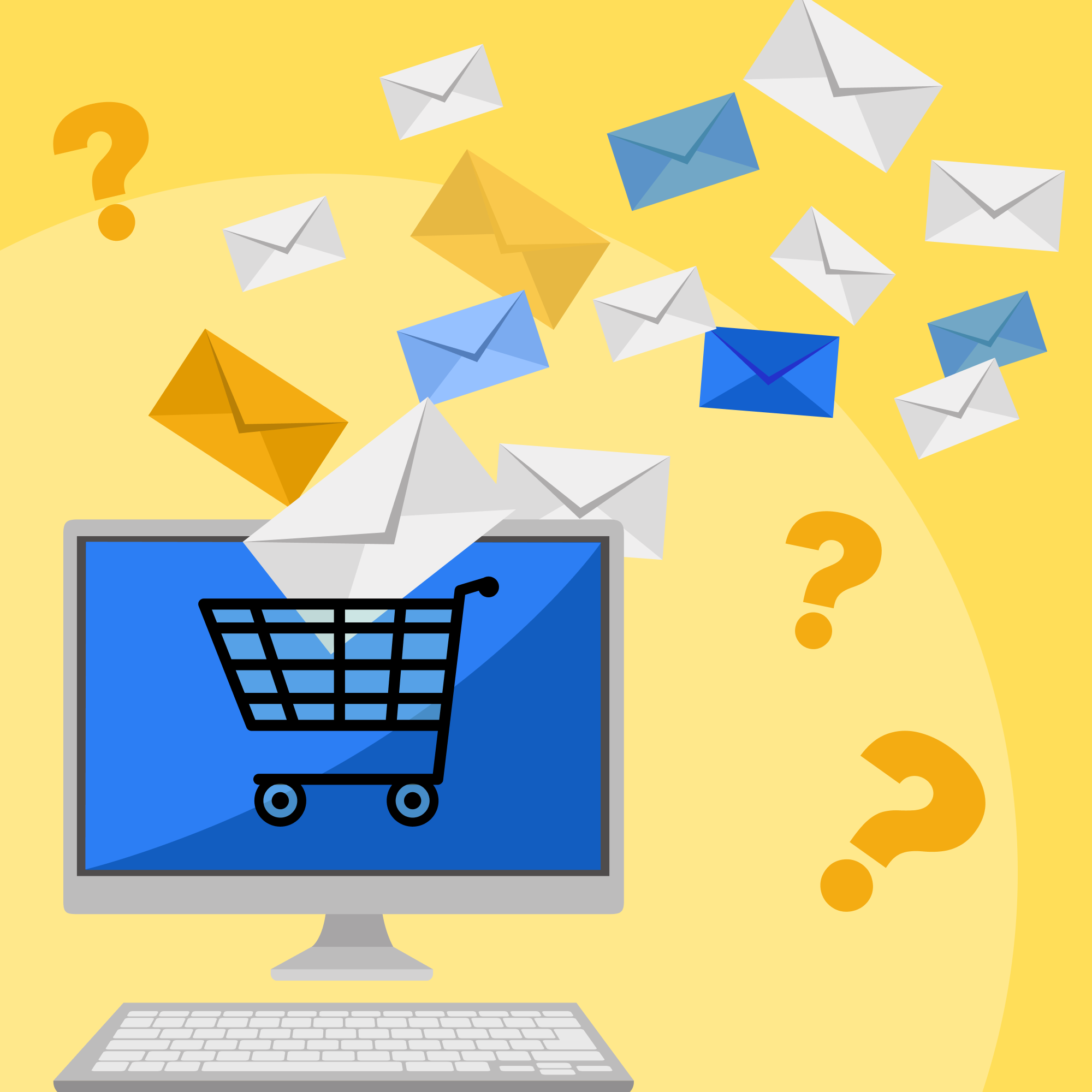
What to Put in an Abandoned Cart Email (Besides ‘Complete Your Order’)
Most abandoned cart emails are boring. They show the cart contents, say “Complete your order,” and that’s it.
That’s fine for email 1 — simple reminder works. But emails 2 and 3 need more substance. You need to address objections, build confidence, and give people a reason to come back.
Here’s exactly what content to include in each email of your abandoned cart sequence, based on what actually drives recovery.
Email 1: The Simple Reminder
Purpose: Catch people who genuinely forgot
When: 1-3 hours after abandonment
What works: Keep it simple. Don’t overcomplicate.
Essential Elements
1. Subject Line That’s Clear
Examples:
- “You left items in your cart”
- “[Name], your cart is waiting”
- “Items in your shopping cart”
Avoid cutesy or clever — this is a functional reminder.
2. Cart Contents with Images
Show exactly what they left:
- Product images (at least 400px wide)
- Product names (full, not truncated)
- Quantities
- Individual prices
- Subtotal
Why images matter: According to research by Marketing Sherpa, emails with product images have 300% higher click-through rates than text-only cart reminders.
3. One Clear Call-to-Action
Don’t give them 5 different buttons. One goal: get them back to checkout.
Text: “Complete Your Purchase” or “Return to Cart”
Make the button:
- High contrast color
- Minimum 44px tall (mobile tappable)
- Above the fold if possible
- Repeated after cart contents (for long emails)
4. Basic Help Offer
Shows you’re accessible, removes “I had a question” as an excuse.
5. Trust Signals in Footer
- Free shipping threshold (“Free shipping over $50”)
- Return policy (“30-day returns”)
- Security badges (SSL, payment logos)
Keep these subtle in email 1. You’re not hard selling yet.
Email 2: The Persuader
Purpose: Address doubts and build confidence
When: 24 hours after email 1
What works: Social proof, reassurance, objection handling
Essential Elements
1. Subject Line That Offers Help or Value
Examples:
- “Still thinking it over?”
- “Need help with your order?”
- “Questions about [Product Name]?”
This positions you as helpful, not pushy.
2. Cart Contents (Again)
Yes, show the cart again. They might not have opened email 1. Repeat the same product display.
3. Customer Reviews and Ratings
This is the KEY differentiator in email 2.
According to research by Spiegel Research Center, displaying reviews can increase conversion rates by 270% for higher-priced items.
Include:
- Star rating
- Number of reviews (social proof)
- 2-3 actual review excerpts (short, focused on benefits)
- Verified buyer badges if possible
- User photos if you have them
4. Address Common Objections
Based on your customer service data, what do people ask about?
Common concerns:
- Shipping costs and timing
- Return policy
- Sizing/fit (for apparel)
- Compatibility (for tech)
- Warranty information
5. Trust Badges and Guarantees
Now you can be more explicit:
✓ 100% Secure Checkout (SSL Encrypted)
✓ 30-Day Money Back Guarantee
✓ Free Returns & Exchanges
✓ 24/7 Customer Support
6. Related Products or “Complete the Look”
If appropriate, show 2-3 complementary items:
Customers who bought this also loved:
[Product image] Phone Case - $24.99
[Product image] Screen Protector - $12.99
This can increase average order value. But don’t overwhelm — max 3 products.
Email 3: The Closer
Purpose: Final push with incentive and urgency
When: 48-72 hours after email 1
What works: Discount, urgency, FOMO
Essential Elements
1. Subject Line with Incentive
Examples:
- “Last chance: 10% off your cart”
- “[Name], here’s 10% off to complete your order”
- “Your exclusive discount (expires tomorrow)”
Now you can mention the discount in subject line.
2. Cart Contents (Yes, Again)
Third time showing the cart. Same format.
3. The Discount Offer (Clear and Prominent)
Make it impossible to miss:
- Show old total and new total
- Display the discount code clearly
- Make code copyable (or auto-apply if possible)
4. Expiration/Urgency
⏰ This offer expires in 24 hours
Or:
Offer valid until [specific date/time]Be specific. “Limited time” is vague and unbelievable. “Expires Friday at 11:59 PM EST” is concrete.
5. Inventory Scarcity (If True)
If the product is actually low in stock, NOW is the time to mention it:
⚠️ Only 3 left in stockBut ONLY if it’s true. Lying about inventory will backfire badly.
6. Last Chance Messaging
This is our final reminder about your cart.

After this, your cart will be cleared and
your discount code will expire.
Set expectation that this is the last email they’ll get.
7. Alternative Offers (Optional)
If discount doesn’t appeal, offer alternatives:
Not ready to buy?
- Add to wishlist for later
- Email me when price drops
- Speak with product expert (for complex items)
Gives them other options besides buying or ignoring.
Additional Content Elements (Use Sparingly)
Video Content
According to Wistia, emails with video see 300% increase in click-through rate.
But use judiciously:
- Email 2 or 3, not email 1
- Only for products that benefit from demonstration
- Keep video SHORT (under 1 minute)
- Make sure it loads fast (thumbnail that links to hosted video)
Size Guides (Apparel)
For clothing/shoes, include in email 2:
Not sure about size?
[Link: View Size Guide]

Or chat with us — we'll help you find the perfect fit.
Sizing uncertainty is a major abandonment reason. Address it directly.
Financing Options (High-Value Items)
For purchases over $200-300:
Pay over time with Klarna:4 interest-free payments of $XX.XX
[Learn More]Can turn “too expensive” into “affordable monthly payment.”
Shipping Calculator
If shipping cost was a concern:
Calculate your exact shipping cost:
[Zip code input] [Calculate]
Remove the mystery, remove the objection.
Gift Wrapping/Gift Message Options
If it’s gift-giving season:
Buying a gift?Add free gift wrapping at checkout
Include a personalized messageSmall add-ons can push people over the edge.
Content to AVOID
Don’t Include:
1. Multiple Competing CTAs
One primary action: return to cart.
Not: “Shop New Arrivals” | “Browse Sale” | “Complete Order” | “Chat With Us”
That’s 4 different actions. Pick one.
2. Your Entire Product Catalog
“You might also like these 20 products!” is overwhelming.
Max 3 related products, and only in email 2 or 3.
3. Long Brand Story
Email 1 is not the place for “Founded in 1987, our mission is…”
Save that for welcome series.
4. Unrelated Promotions
Don’t say “Complete your cart” and then “PS: Check out our new spring collection!”
Stay focused.
5. Manipulative Language
Avoid:
- “You’re going to regret not buying this”
- “Everyone else is buying it, why aren’t you?”
- “This might be your last chance EVER”
Respectful urgency, not guilt trips.
Mobile Optimization
According to Litmus, 60%+ of emails are opened on mobile. Your content must work on small screens.
Mobile-Friendly Practices:
- Short subject lines: Under 40 characters (displays fully on mobile)
- Large images: Minimum 400px wide (looks good on retina)
- Big buttons: Minimum 44x44px (easy to tap)
- Short paragraphs: 2-3 lines max per paragraph
- Scannable format: Bullets, headers, white space
- Single column: Multi-column layouts break on mobile
- Test on real devices: Send to yourself, check iPhone and Android
Content Checklist by Email
Email 1
- Clear subject line (simple reminder)
- Cart contents with images
- Subtotal
- One CTA button
- Help contact info
- Basic trust signals (footer)
Email 2
- Helpful subject line
- Cart contents with images
- Customer reviews (2-3 excerpts)
- Star rating
- FAQ (3-5 common questions)
- Trust badges
- One CTA button
- Optional: Related products (max 3)
Email 3
- Subject line with incentive
- Cart contents
- Discount offer (clear and prominent)
- Discount code
- New total after discount
- Expiration date/time
- Urgency element (if true)
- “Last chance” messaging
- One primary CTA
The Bottom Line
Each email in your abandoned cart sequence serves a different purpose:
Email 1 = Reminder Keep it simple. Cart contents, CTA, done.
Email 2 = Persuasion Build confidence with reviews, address objections with FAQ, reinforce trust.
Email 3 = Closing Offer incentive, create urgency, make final push.
Don’t dump everything into email 1. Save your ammunition. Build a sequence where each email adds new value and new reasons to buy.
Test different content elements for your audience, but this structure has been proven across thousands of campaigns and billions in recovered revenue.